In an era where Software as a Service (SaaS) applications dominate the digital ecosystem, standing out isn’t just about user experience or pricing—it’s also about branding. Central to a strong branding effort is a memorable and relevant logo that visually communicates the product’s core proposition. For SaaS companies that specialize in API offerings and integrations, designing a logo that reflects connectivity, scalability, and flexibility is crucial.
TLDR
Logos for API and integration-driven SaaS products should symbolize connectivity, data flow, and modularity. Avoid overly complex visuals and instead focus on abstract shapes and minimalist designs that speak to the modern tech audience. This article outlines eight conceptual directions you can take to reinforce your product’s mission through visual identity. From intertwined lines to circuit-inspired icons, these concepts aim to blend innovation with clarity.
1. Interconnected Nodes
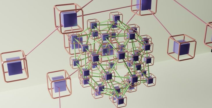
An effective way to represent API and data integrations is through a logo that uses interconnected nodes. These can symbolize elements like data points, services, or systems that communicate with each other. The use of nodes and lines forming networks sends a clear visual message: “We bring systems together.”
- Design Tip: Opt for a minimal number of well-aligned nodes with curved connections for an aesthetically pleasing balance between complexity and clarity.
- Color Palette: Use a combination of soft blues and greens to evoke trust, security, and growth.

2. Puzzle Piece Symbolism
Puzzle pieces are a classic metaphor for integration. Using interlocking puzzle parts in a logo implies that the SaaS product can fit and work effortlessly with other systems. This concept is particularly useful for companies that offer plug-and-play type APIs.
- Design Tip: Keep the puzzle pieces abstract to avoid a childish tone. Angular cuts and geometric fills can modernize this classic imagery.
- Best Use: Ideal for platforms offering a marketplace of integrations or modular services.
3. The Infinite Loop or Möbius Strip
The infinite loop signifies continuity, efficiency, and endless scalability—qualities that are highly valued in any SaaS product. As a logo concept, a Möbius Strip delivers elegance while hinting at seamless 24/7 integration and circulation of data.
- Color Palette: Gradient transitions from light to dark blues or purples give the sense of movement and transformation.
- Pro Tip: Combine the loop shape with subtle arrows to reinforce the idea of flow and directionality.

4. Circuit-Inspired Geometry
Using simplified representations of circuits can signal the technological backbone of your API services. Icons that mimic the structure of a circuit board evoke sophistication and highlight the digital and functional nature of the product.
- Best For: APIs that service low-level functionalities like database access or infrastructure communication.
- Typography Pairing: Sans-serif fonts with a semi-bold weight complement this tech-heavy visual style.
5. Chain Links or Interlocking Shapes
The use of interlocking shapes or a chain link formation in a logo can elegantly express permanence and trust in a system of connected services. It can signify that every component is a vital part of the bigger picture.
- Ideal For: Enterprise-focused integration platforms where security and reliability are vital selling points.
- Design Suggestions: Experiment with hexagonal or circular motifs as linking objects for a refreshing twist on the chain concept.
6. Cloud Elements with Embedded Arrows or Paths
Many SaaS solutions are cloud-hosted, and that cloud iconography itself becomes instantly recognizable. Enhance the traditional cloud symbol with arrows or flow paths to signify API transactions and data travel.
- Best For: API services geared toward developers managing data pipelines or ETL operations.
- Important Note: Avoid clichés by combining the cloud outline with unique movement cues like arcs or dash lines.
7. Abstract Initials with a Data Motif
Sometimes, simplicity reigns. Custom typographic treatments using your company’s initials superimposed with subtle data motifs—such as dashes, dots, or slashes—can deliver a powerful logo.
- Design Tip: Consider merging letterforms to resemble pathways or connections, turning typography into symbolic representation.
- Color Palette: Monochrome approaches with silver or slate gray can convey maturity and professionalism.
8. Modular Building Blocks
For products that offer scalable or customizable APIs, representing your logo with modular blocks implies flexibility and composability. These blocks can form various shapes or even morph across marketing materials to reflect your adaptive nature.
- Design Advice: Use soft shadows and gradient fills for a modern, layered look that feels both tactile and digital.
- Multipurpose: This concept translates well into app icons, favicons, and animated logo builds.

Final Thoughts
Creating a logo for an API or integration-driven SaaS is more than a cosmetic decision—it’s a strategic choice that affects how your brand is perceived. The iconography, color usage, and typography must collectively resonate with tech-savvy decision-makers, developers, and partners. A well-thought-out logo can subtly communicate functionality, professionalism, and innovation, elements that set your product apart in a competitive market.
FAQ
- Q: How important is a logo for an API-first SaaS product?
A well-designed logo enhances brand recognition and gives a professional first impression. For API-first products, it’s a way to visually communicate integration and connectivity-focused values. - Q: Should I avoid using text in the logo?
Not necessarily. Many companies successfully incorporate initials or abbreviations into their logos. Just ensure the text is legible at smaller sizes. - Q: Do animated logos work better for tech products?
Animated logos can be impactful on digital touchpoints like onboarding screens or product demos. However, ensure the static version remains strong and recognizable. - Q: How often should a SaaS company update its logo?
Rebranding or logo updates are typically done every 5–10 years or after major shifts in company direction or offerings. - Q: What file formats should I have for my logo?
Keep a collection including SVG (for web), PNG (for presentation use), and EPS (for high-quality printing). Consider also having a monochrome version for flexibility.
