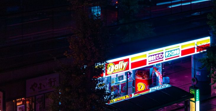
Japan’s ubiquitous konbini—short for “convenience store” in Japanese—represent far more than just a place to buy snacks and drinks. These sleek, efficient retail spaces are paragons of smart design, high functionality, and user experience. With over 50,000 scattered across the country and brands like 7-Eleven, Lawson, and FamilyMart dominating the streets, Japanese convenience stores illuminate an incredible combination of layout planning, service innovation, and cultural integration in retail architecture.
TLDR
Japanese convenience stores, or konbini, are masterclasses in efficient layout, design, and customer satisfaction. They maximize small urban spaces, offering an incredible range of services and products 24/7. Their layout is intentionally structured to facilitate flow and optimize consumer access. Understanding their design gives insight into Japan’s unique approach to urban life and retail convenience.
The Urban Necessity of Combini
Japanese cities are typified by dense populations, limited space, and an incredibly fast-paced lifestyle. Against this backdrop, the konbini has become nothing short of essential. Open 24/7 and stocked with everything from freshly made meals and toiletries to banking services and package drop-offs, they reflect the highest priorities in urban planning: efficiency, accessibility, and community utility.
The genius behind their design lies in how they cater not just to consumers’ need for products but also to their need for speed and intuitive usability. Whether it’s a salaryman grabbing a midnight bento or a student printing homework at 3 AM, the convenience store is always just around the corner—literally.
Store Layout: Minimalist and Intuitive
The layout of a Japanese convenience store is deliberately designed to promote smooth traffic flow, reduce friction for buyers, and maximize sales per square meter. Even stores as small as 100 square meters are engineered for maximum impact.
- Right-Side Entry Flow: Consumers usually enter on the right side where promotional displays—seasonal items or discounted goods—immediately catch their eye.
- Flow to Food First: One of the unique principles is leading customers directly to freshly made food or drinks. Whether it’s warm buns, ramen, or sushi, it’s usually located in the middle or left-central area.
- Back Wall Essentials: Staple products like milk, eggs, and soft drinks are reliably placed at the back, subtly encouraging customers to walk through the store and make impulse purchases on the way.
- Counter Placement: Checkout counters are typically positioned at the front-left corner, opposite the entrance, aiding surveillance and ensuring a visible employee presence.
This consistent spatial arrangement allows for what the Japanese call “walking efficiency.” It makes shopping fast and predictable, even if you’re visiting a store for the first time.
Lighting and Visual Branding
Japanese convenience stores use a distinctive combination of visuals and atmosphere to create a sense of calm and clarity. Fluorescent lighting is standard, but it’s artfully implemented to highlight shelves without overwhelming the space. Coupled with easy-to-read, colorful signage, the design aims for visual legibility at all times.
Each brand comes with subtle architectural identifiers:
- 7-Eleven: Known for open floor plans and symmetrical aisle layout. The branding uses bold reds and greens to evoke dependability and vibrancy.
- Lawson: Often adopting a softer blue-and-white theme, Lawson stores feel gentler and community-focused, sometimes including quiet areas and seating.
- FamilyMart: Focuses on gentle curves and relaxed brightness. Its use of teal and white gives it a fresh, clean appeal.
This consistency builds subconscious familiarity, helping customers identify and locate what they need effortlessly.
Services Beyond Retail
Design also supports an expansive array of non-product services embedded into everyday life. These include:
- Multifunction ATMs: Not only do they allow bank withdrawals but also transfer services, tax payments, and ticket purchases.
- Multilingual Touchscreens: Available for tourists and expats, adding accessibility without the need for additional staffing.
- Package Delivery Pickups: With small locker-like compartments near the entrance, customers can retrieve Amazon or Rakuten orders seamlessly.
- Free Wi-Fi Zones: Often with subtle signage to prevent clutter yet still offer essential connectivity.
These services are unobtrusive but are integrated so that physical movement inside the store doesn’t conflict with shoppers browsing food aisles. This division of space is subtle but effective.
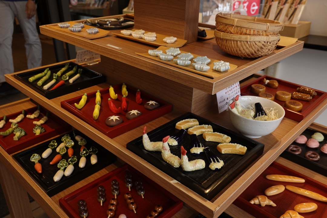
Ergonomic Shelf Design
The shelving systems inside Japanese convenience stores are marvels of ergonomic and psychological design. Products aimed at specific demographics are often placed within their eye lines. For instance:
- Children’s candies and treats: Bottom shelves
- Adult grab-and-go items: Middle shelves (eye-level)
- Low-priority or less-frequent items: Top shelves
The consistent product grouping strategy ensures that regular visitors can locate their items intuitively: snacks are in one aisle, lunchboxes and drinks in another. Rarely does the interior design make drastic changes, which speaks to the Japanese value of reliable consistency over flashy innovation.
Image not found in postmetaBehind-the-Scenes Efficiency
What customers don’t see is just as carefully designed. Combini systems include efficient inventory logistics and supply chain timing. Deliveries are frequent—often multiple times daily—to ensure constant freshness, especially for perishable items like rice balls (onigiri), salads, and desserts.
Backrooms are compact but cleverly engineered for maximum stocking capacity. Most stocking is done during off-peak hours, guided by real-time inventory data collected via sensors and POS software. This reduces clutter on the retail floor and maintains a seamless shopping experience throughout the day.
Localization and Seasonal Adaptability
No two konbini are entirely alike. Convenience stores adapt to their neighborhoods and seasons. A store near a high school may stock more affordable snacks and school supplies. In contrast, a konbini near an office tower might expand its ready-to-eat lunch offerings and even offer suit-lint rollers for busy workers.
Seasonal adaptability is another strength:
- Spring: Cherry blossom themed packaging and picnic supplies
- Summer: Hydration aids, cooling wipes, summer festivals promotions
- Autumn: Roasted sweet snacks, harvest-themed desserts
- Winter: Hot drinks, heating pads, oden (hot pot) counters
This dynamic product turnover is supported by modular shelving and display systems that can be easily reconfigured, maintaining a sense of freshness and novelty while still being intuitively navigable.
Customer-Centric Innovations
Perhaps the most awe-inspiring part of Japanese convenience store design is its very human focus. Everything down to the pen at the counter is there to aid, not intrude. Quiet shopping is respected. Efficient, friendly service is non-negotiable. Even the beep of the cash register is at a specifically chosen pitch that is pleasant and non-startling.
Employee areas are carefully sectioned off. There’s also strategic use of mirror panels and transparent cooling cabinets to reduce feelings of narrowness. For people with disabilities, aisle widths and counter heights are increasingly being adapted to ensure universal design practices.
Conclusion: Design as a Philosophy
What distinguishes the design of Japanese convenience stores from their global counterparts is not just beauty or efficiency—it’s empathy. The architecture acknowledges and respects the pace of life around it. The user experience is orchestrated to deliver not just availability, but also emotional comfort.
In a country where time and space are rare luxuries, the konbini offers both, packaged neatly in a 24-hour, 100-square-meter capsule. And that makes every design detail—from bright lighting to aisle positioning—a potent lesson in hospitality, urbanism, and trust.