
A Circos PNG is a raster image exported from a Circos visualization: a circular data diagram used to display relationships, patterns, and comparisons across complex datasets. If you have ever seen a scientific plot with a ring-shaped layout, colored arcs around the edge, and graceful ribbons crossing the center, you have probably seen a Circos-style figure. The “PNG” part simply means the image has been saved in the Portable Network Graphics format, making it easy to share, embed, and publish across websites, reports, slides, and documents.
TLDR: A Circos PNG is a static image version of a circular data visualization, commonly used in genomics, bioinformatics, network analysis, and comparative data studies. It combines circular tracks, labels, colors, and connecting ribbons to show relationships that may be difficult to understand in a table or linear chart. PNG makes the visualization portable and widely compatible, though it is not as editable or scalable as vector formats. Circos PNG files are especially useful when you need a visually rich, publication-ready snapshot of complex relationships.
Understanding the Circos Visualization Concept
Circos diagrams were originally popularized in the life sciences, especially for visualizing genomic relationships such as chromosomal rearrangements, gene fusions, sequence alignments, and comparative genome structures. However, the format has grown beyond biology. Today, circular relationship diagrams are used in fields such as finance, cybersecurity, social network analysis, linguistics, transportation planning, and business intelligence.
The core idea is simple but powerful: data categories are arranged around a circle, and relationships between them are drawn as lines, curves, or ribbons inside the circle. Additional data can be layered as concentric tracks, such as heatmaps, histograms, scatter plots, line plots, and categorical annotations.
This circular layout makes it possible to show many-to-many relationships in a compact spatial form. Instead of forcing data into rows and columns, a Circos diagram gives the viewer a panoramic overview of connections, densities, clusters, and anomalies.
What Does “PNG” Mean in Circos PNG?
PNG stands for Portable Network Graphics, a common raster image format designed for lossless compression. A PNG file stores an image as a grid of pixels. Unlike JPEG, PNG preserves crisp lines, solid colors, and transparency without introducing compression artifacts. This makes it a good choice for diagrams, charts, scientific figures, interface screenshots, and technical graphics.
When a Circos visualization is exported as a PNG, it becomes a static pixel-based image. You can open it in standard image viewers, insert it into a presentation, upload it to a website, or include it in a report. However, because it is raster-based, it does not retain the underlying data structure or editable vector elements. You cannot easily click a ribbon and change its source, resize labels without quality loss, or modify individual tracks unless you return to the original configuration or data files.
Main Components of a Circos PNG
A Circos PNG can look visually complex, but it is usually built from a set of recognizable elements. Understanding these components makes the image easier to interpret and easier to design.
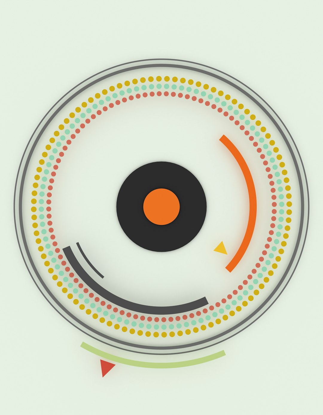
- Ideograms: The outer segments of the circle, representing categories such as chromosomes, regions, departments, countries, products, or network nodes.
- Ticks and labels: Markers around the perimeter that provide scale, names, or coordinate positions.
- Links or ribbons: Curved connectors that show relationships between two or more regions. Their thickness, color, or opacity may represent strength, frequency, or type.
- Tracks: Circular bands around the diagram that display additional datasets, such as density, expression values, event counts, or classification groups.
- Color encoding: A visual system that helps distinguish categories, highlight patterns, and communicate meaning quickly.
- Legends and annotations: Supporting text and symbols that explain the visual language used in the diagram.
These elements work together to transform abstract data into a structured visual landscape. A strong Circos PNG does not merely look impressive; it helps viewers find signals in complexity.
Why Use a Circos PNG?
The major advantage of a Circos PNG is its ability to summarize dense relational information in a visually engaging format. Some datasets are difficult to explain with ordinary bar charts or spreadsheets because the important information lies in the connections rather than the individual values. Circos diagrams are designed precisely for such situations.
For example, in genomics, a Circos PNG can show how sections of one chromosome correspond to sections of another. In cybersecurity, it might show traffic flows between servers, IP regions, or threat categories. In business analytics, it can represent customer migration between product tiers, supply chain dependencies, or cross-market interactions.
A Circos PNG is also useful because it is easy to distribute. It does not require viewers to install specialized software, load datasets, or run scripts. The visualization is already rendered and ready to view. This is particularly valuable in academic publishing, executive reporting, digital dashboards, and conference presentations.
Common Technical Workflow
Creating a Circos PNG usually involves several stages. While tools vary, the technical logic is broadly similar.
- Prepare the data: Data must be structured into files describing segments, coordinates, values, and relationships.
- Define the layout: The circular arrangement is configured, including segment order, colors, sizes, spacing, and scales.
- Add tracks: Additional visual layers are added to show measurements, categories, or statistical summaries.
- Configure links: Relationship data is mapped to curves or ribbons inside the circle.
- Style the figure: Fonts, colors, line widths, opacity, backgrounds, and legends are adjusted.
- Render the output: The final visualization is exported into a format such as PNG, SVG, PDF, or JPG.
In a technical environment, the diagram may be generated by command-line tools, scripting libraries, or custom visualization platforms. The PNG export is often the final output, while the underlying configuration files remain the editable source.
Circos PNG in Genomics and Bioinformatics
The most iconic use of Circos diagrams is in genomics. Genome-scale data is naturally suited to circular visualization because chromosomes or genomic regions can be arranged around the circumference. Structural variants, copy number changes, synteny relationships, gene expression levels, mutation density, and sequence alignments can then be layered in a compact overview.
For instance, a cancer genomics Circos PNG might show chromosomes around the outer ring, copy number gains and losses in colored tracks, mutation density as a histogram, and chromosomal translocations as ribbons crossing the center. What would require many pages of tables can be understood at a glance: where the genome is unstable, which chromosomes interact, and which regions contain dense clusters of events.
This is why Circos PNGs are often seen in research papers, genomics portals, supplementary materials, and scientific presentations. They provide both analytical value and visual impact.
Strengths of the PNG Format
PNG is especially well suited for Circos images when the final intent is viewing, sharing, or embedding. Its strengths include:
- Lossless compression: It preserves clean edges, text, and colors without the blurring or artifacts common in JPEG.
- Transparency support: PNG can include transparent backgrounds, making it easier to place the figure on slides or web pages.
- Wide compatibility: Almost every browser, operating system, document editor, and presentation tool supports PNG.
- Consistent appearance: A PNG looks the same across platforms because it is already rendered as pixels.
These features make PNG a practical choice for finalized diagrams. If the image dimensions and resolution are chosen carefully, the result can be sharp, professional, and highly portable.
Limitations of a Circos PNG
Despite its convenience, a Circos PNG has several limitations. The most important is that it is not resolution independent. If you enlarge it too much, it may become pixelated. Text labels can become blurry, fine lines can lose clarity, and small details may become difficult to read.
Another limitation is editability. Because the image is flattened into pixels, you cannot easily adjust a single data track or recolor one ribbon without editing the original visualization source. For professional publication workflows, vector formats such as SVG or PDF are often preferred because they retain scalable shapes and editable elements. PNG is best viewed as a final rendered snapshot, not the master source file.
File size can also become an issue. High-resolution Circos PNGs with many colors, transparency, and fine details can be large, especially if intended for print. Choosing the right dimensions and compression settings is part of producing an efficient output.
Design Considerations for Readable Circos PNGs
A Circos PNG can become visually overwhelming if too much data is included. The circular format is powerful, but it requires discipline. Good design begins with deciding what the viewer should learn from the image.
Important design practices include:
- Limit visual clutter: Avoid adding every possible track unless each one contributes meaningfully.
- Use color intentionally: Colors should encode categories or values, not merely decorate the figure.
- Control label density: Too many labels around a circle can reduce readability.
- Prioritize contrast: Ensure ribbons, tracks, and text remain visible against the background.
- Include a legend: Viewers need clear explanations of what colors, sizes, and positions mean.
- Export at sufficient resolution: A diagram that looks good on screen may not be sharp enough for print.
The best Circos PNGs balance complexity and clarity. They invite exploration without forcing the viewer to decode a visual puzzle.
Resolution, DPI, and Output Quality
When exporting a Circos PNG, technical settings matter. Image dimensions are usually measured in pixels, such as 1200 by 1200 or 3000 by 3000. Larger dimensions capture more detail and allow the image to be printed or zoomed more effectively. However, larger images also create bigger files.
DPI, or dots per inch, is especially relevant for print. A figure intended for a journal may need 300 DPI or higher, while a web image may only need enough pixels to appear sharp on modern displays. For a square Circos diagram, it is common to export at a high resolution and then scale down as needed. This helps preserve fine lines and labels.
Anti-aliasing is another factor. It smooths curves and diagonal lines so that circular elements look less jagged. Since Circos diagrams rely heavily on arcs and curves, high-quality anti-aliasing can significantly improve the final PNG.
How to Interpret a Circos PNG
To read a Circos PNG effectively, start from the outside and move inward. First, identify what the outer segments represent. Then check the scale, labels, and color scheme. Next, examine the tracks to understand what measurements are being shown. Finally, look at the internal ribbons or links and ask what relationships they represent.
Thicker ribbons may indicate stronger relationships, larger quantities, or more frequent events. Colors may indicate source categories, destination categories, relationship types, or statistical significance. Clusters of links can reveal hotspots, while isolated links may point to unusual or noteworthy connections.
It is important not to treat the diagram as purely decorative. A Circos PNG is a compressed analytical object. Every arc, band, and ribbon should correspond to a data decision.
Final Thoughts
A Circos PNG is more than a beautiful circular chart. It is a technical visualization output that combines relational data, layered measurements, and thoughtful graphical design into a portable image format. Its strength lies in making complex connections visible, especially when linear charts cannot easily capture the structure of the data.
At the same time, PNG should be understood as a finished rendering rather than an editable data file. For sharing, presentations, web publishing, and quick visual communication, it is highly effective. For editing, scaling, or publication production, it is often wise to keep the original data and configuration files, and possibly export a vector version as well.
Used carefully, a Circos PNG can turn overwhelming datasets into a compelling visual story. It helps researchers, analysts, and decision-makers see not only individual values, but the relationships that connect them.