Mobile traffic has permanently overtaken desktop across most industries, and by 2026, Google’s mobile-first indexing and user experience signals make seamless communication critical for conversions. One of the most powerful yet under-optimized elements on business websites today is the click-to-call (CTC) button. When implemented correctly, it reduces friction, improves trust, and dramatically increases lead generation—especially for service-based businesses and local companies.
TLDR: A high-conversion click-to-call button must be prominently placed, technically optimized, and designed specifically for mobile user behavior. Use clear, action-driven text, contrast colors, sticky positioning, and proper tel: formatting. Track events in analytics, test placement and copy, and ensure fast load speeds to maximize performance. In 2026, mobile UX success depends on minimizing friction—and click-to-call is one of the fastest ways to do it.
Why Click-To-Call Matters More in 2026
Mobile users are goal-oriented. When they visit a service website—whether it’s legal services, HVAC repair, medical offices, or consulting—their intent is often immediate. They are not browsing casually; they want answers.
A click-to-call button eliminates:
- Typing friction (copying and pasting numbers)
- Navigation friction (searching the contact page)
- Decision hesitation (unclear next steps)
In competitive markets, friction equals lost revenue. Studies consistently show that reducing steps in the conversion path increases call volume by 20–60% depending on industry.
Additionally, Google’s Core Web Vitals and engagement metrics now weigh user interaction signals more heavily. Prominent, accessible call functionality improves:
- Mobile engagement rates
- Time on site
- Conversion events
- Local SEO performance
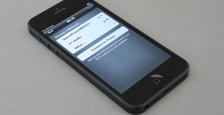
Step 1: Add the Click-To-Call Link Correctly
The technical implementation must use the proper tel: protocol format. This ensures smartphones immediately trigger the dialer.
Correct format example:
<a href=”tel:+15551234567″>Call Now</a>
Best practices:
- Use international format with country code (+1, +44, etc.)
- Avoid spaces or special characters inside the number string
- Test across iOS and Android devices
On WordPress, you can insert this in:
- Gutenberg button blocks
- Header navigation menus
- Widgets or footer areas
- Page builder button modules
However, technical correctness alone does not ensure conversion. Placement and design are what transform a simple link into a revenue driver.
Step 2: Optimize Placement for Maximum Visibility
In 2026 mobile UX, thumb-friendly positioning is critical. Heatmap data consistently shows highest tap activity within the lower center and lower right zones of a mobile screen.
High-converting placements include:
- Sticky bottom bar button (remains visible while scrolling)
- Top-right header button (for immediate access)
- Hero section primary CTA
- After service descriptions
The most effective configuration for service businesses is typically:
- Primary hero “Call Now” button
- Sticky bottom mobile call bar
Avoid placing the only call button exclusively in the footer. That forces scrolling and lowers conversions significantly.
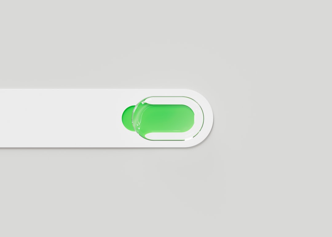
Step 3: Use High-Contrast, Action-Oriented Design
A click-to-call button must visually dominate surrounding elements without feeling aggressive. The key factors are:
1. Color Psychology
- Green = action, go, availability
- Orange = urgency
- Blue = trust and reliability
- Red = emergency services only
The button should contrast strongly against the background. If your brand palette is muted, create deliberate contrast for conversion elements.
2. Clear Microcopy
Avoid vague text like “Contact Us.” Instead use:
- Call Now
- Speak to an Expert
- Get Immediate Help
- Book by Phone
Specific language increases psychological commitment.
3. Add a Phone Icon
Icons increase recognition speed. A simple handset icon next to the text improves tap rates, especially for older demographics.
Step 4: Implement a Sticky Mobile Call Bar
The sticky call bar remains fixed at the bottom of the mobile screen. This dramatically reduces friction because users never need to scroll back up.
Best practices for sticky bars:
- Height between 50–70px
- Large tap area (minimum 44px height per accessibility standards)
- Clear text and icon
- Minimal secondary elements
Make sure it does not obscure important content or violate Google’s intrusive interstitial guidelines.
Step 5: Track Click-To-Call Conversions Properly
Many WordPress sites fail to track phone clicks correctly. Without tracking, optimization is guesswork.
Use event tracking through:
- Google Tag Manager
- GA4 event tracking
- Conversion tracking inside ad platforms
Configure events when users click any link containing tel:. Then assign it as a primary conversion.
Track these metrics:
- Click-through rate on call button
- Call volume by traffic source
- Conversion rate per landing page
- Time-to-call after page load
This data enables intelligent layout testing rather than relying on assumptions.
Step 6: Optimize Page Speed for Instant Interaction
By 2026, mobile users expect interaction readiness within 2 seconds. If your site lags, they won’t wait to call.

To improve responsiveness:
- Compress images (WebP format preferred)
- Use server-side caching
- Minify CSS and JavaScript
- Use a lightweight WordPress theme
The faster the page loads, the sooner users see—and tap—the call button.
Step 7: Use Contextual Call Prompts
One of the biggest missed opportunities is contextual triggers.
Instead of only using a static global button, add call prompts:
- After pricing sections
- Under testimonials
- At the end of blog posts targeting high-intent keywords
For example:
“Have questions about this service? Call our team now for immediate assistance.”
This aligns the call action with user intent.
Step 8: Consider Business Hours and Smart Routing
A common user frustration occurs when clicking “Call Now” outside business hours and receiving no answer.
In 2026 UX best practice includes:
- Displaying open/closed status near call button
- Changing CTA text after hours (“Leave a Message”)
- Routing to voicemail systems intentionally
This reduces abandonment and maintains trust.
A/B Testing for Continuous Improvement
High-conversion optimization never stops. Test variations such as:
- Green vs. orange buttons
- Sticky bar vs. floating circle
- “Call Now” vs. “Get Free Consultation”
- Icon left vs. icon right alignment
Even small changes can yield measurable improvements. For high-traffic sites, 5–10% gains in call rates translate into substantial revenue increases.
Common Mistakes to Avoid
- Hiding the number only inside images (not clickable)
- Using JavaScript-only links without proper fallback
- Making the button too small to tap comfortably
- Cluttering the mobile header with too many CTAs
- Failing to test on real devices
The most damaging mistake is assuming that “having a phone number visible” equals mobile optimization. Visibility alone does not equal usability.
Accessibility and Compliance Considerations
A high-conversion button must also be accessible.
- Maintain adequate color contrast ratios
- Use aria-label attributes for screen readers
- Ensure keyboard navigation compatibility
- Provide text alternatives for icons
Accessible design does not just serve compliance—it expands your reachable audience.
Final Thoughts: Click-To-Call as a Strategic Conversion Asset
In the 2026 mobile landscape, attention spans are short and competition is intense. Businesses that remove friction win. A strategically designed click-to-call button is not a design accessory—it is a primary revenue mechanism.
When implemented with correct technical formatting, optimized placement, strong visual hierarchy, contextual timing, event tracking, and continuous testing, the click-to-call feature becomes one of the highest ROI elements on a WordPress website.
Mobile users want immediacy. They want clarity. They want human connection without effort. If your WordPress site delivers that with a single tap, you are positioned for measurable conversion growth in 2026 and beyond.