
Infographics turn complex information into something people can understand, remember, and share. For businesses, they can simplify reports, explain products, support sales presentations, and make blog content more engaging. For bloggers, they offer a way to stand out in crowded search results and social feeds by presenting ideas visually instead of relying only on long paragraphs.
TLDR: Creative infographic design tools help businesses and bloggers transform data, processes, and ideas into attractive visual stories. The best tools offer templates, charts, icons, brand controls, and export options that make design faster and more professional. Whether you need a quick social media graphic or a detailed data visualization, choosing the right platform depends on your goals, skill level, budget, and content workflow.
Why Infographics Still Matter
In a digital world overflowing with content, people often scan before they read. A well-designed infographic gives readers a reason to pause. It combines visual hierarchy, concise writing, data, and storytelling into one easy-to-digest format. Instead of asking your audience to interpret a spreadsheet, read a long report, or follow a dense tutorial, an infographic guides them through the key points visually.
For businesses, infographics are useful in marketing, human resources, customer education, training, investor updates, and internal communications. A sales team might use one to compare product features. A startup might use one to explain market trends. A consultant might turn research findings into a shareable graphic that attracts leads.
Bloggers benefit just as much. Infographics can summarize list posts, illustrate timelines, compare tools, highlight statistics, or explain step-by-step processes. They can also support search engine optimization because readers are more likely to stay on a page, share the post, and link to useful visual assets.

What Makes a Good Infographic Design Tool?
A good infographic tool is not just a blank canvas. It should help you move from idea to finished design without getting stuck in technical details. The best platforms combine creative flexibility with practical features that save time.
When evaluating tools, look for these features:
- Templates: Professionally designed layouts for reports, timelines, comparisons, checklists, and data summaries.
- Chart and graph builders: Tools for turning numbers into bar charts, pie charts, maps, line graphs, and visual data blocks.
- Icons and illustrations: Built-in visual libraries that make it easier to explain ideas quickly.
- Branding controls: The ability to save logos, fonts, colors, and reusable design assets.
- Collaboration features: Commenting, shared folders, approval workflows, and team permissions.
- Export options: Downloads for PNG, JPG, PDF, interactive formats, presentations, and social media sizes.
- Ease of use: A clean interface that works for non-designers as well as experienced creatives.
The right tool should match your purpose. A blogger creating Pinterest graphics may need speed and templates. A data journalist may need precise charting. A marketing department may need collaboration, brand consistency, and presentation-ready exports.
Beginner-Friendly Infographic Tools
For many bloggers and small businesses, the biggest challenge is not creativity but time. Beginner-friendly tools help users create polished visuals without learning professional design software.
Canva is one of the most widely used design platforms for simple infographics, social content, presentations, and blog visuals. Its drag-and-drop editor, large template library, and easy resizing options make it appealing to teams that need fast content. Users can customize colors, fonts, icons, charts, and illustrations with minimal effort. It is especially useful for bloggers who want to repurpose one infographic into several formats, such as a blog header, Instagram post, and Pinterest pin.
Piktochart is another strong option for people who want to create infographics, reports, posters, and presentations. It focuses heavily on visual communication and includes templates designed for business reports, education, marketing, and nonprofit storytelling. Its interface is simple, but it still offers enough control for creating professional layouts.
Venngage is particularly useful for business infographics, human resources materials, process diagrams, and visual reports. It offers a large collection of templates arranged by use case, which helps users start with the right structure instead of staring at a blank page. Businesses that create training materials, comparison graphics, or strategy visuals often find this type of template organization helpful.
Adobe Express is a good fit for users who want stylish, quick graphics and may already be familiar with Adobe products. It offers templates, branding options, basic animation, and access to a broad creative ecosystem. It is less intimidating than advanced professional software while still producing sleek results.
Tools for Data Heavy Infographics
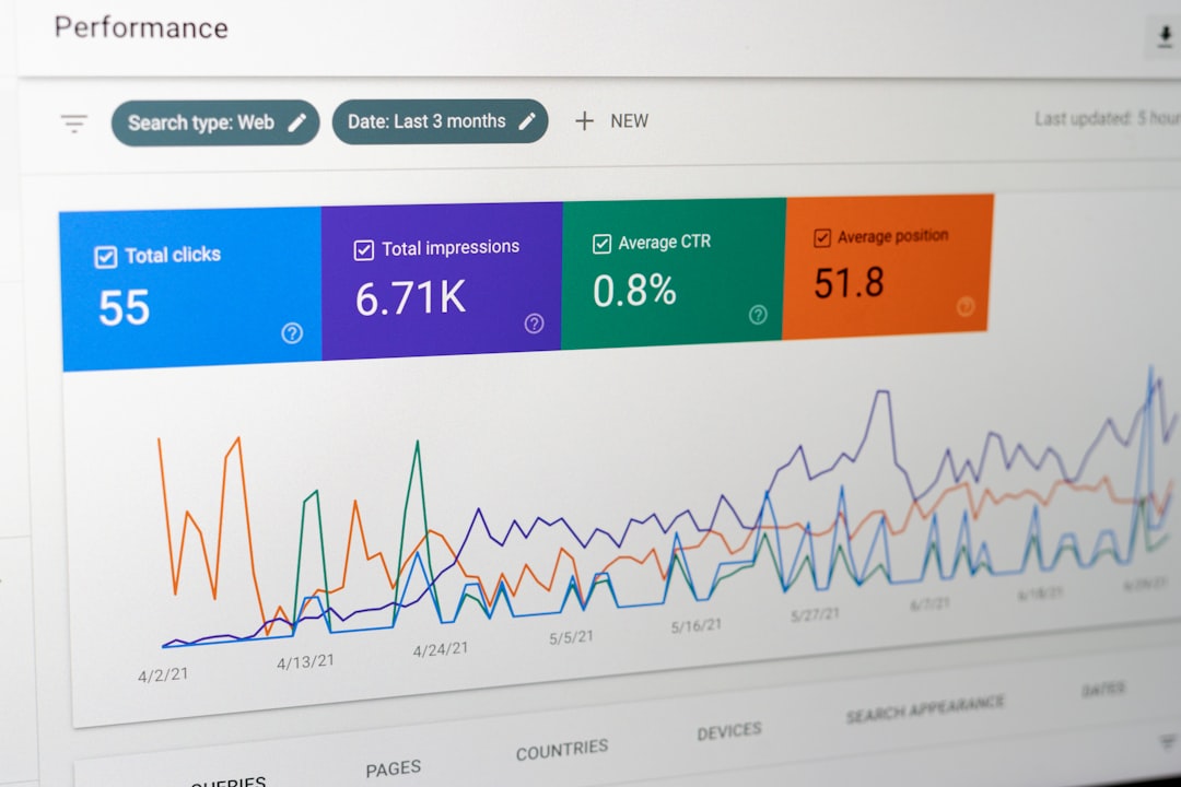
Some infographics are less about decoration and more about making data clear. If your content depends on charts, survey results, financial information, or research findings, you need a tool that handles data visualization well.
Infogram is built for charts, maps, dashboards, and interactive data stories. It allows users to upload data, create visualizations, and publish interactive graphics online. Businesses can use it for annual reports, analytics summaries, market research, and media content. Bloggers who publish statistics-based articles can use it to make data more engaging and credible.
Datawrapper is popular among journalists, researchers, and content teams that want clean, accurate charts and maps. It is known for producing professional data visualizations without unnecessary clutter. If your priority is clarity, especially for public-facing statistics, this kind of tool can be extremely valuable.
Flourish is ideal for interactive and animated data storytelling. It can create impressive visualizations such as moving charts, maps, scatter plots, and animated comparisons. For businesses publishing thought leadership content or bloggers covering trends, interactive graphics can increase engagement and make data feel more alive.
Design Tools for Custom Infographics
Template-based tools are convenient, but sometimes you need more control. Custom design tools are better for brands that want highly original infographics, unique layouts, or complex visual systems.
Figma is excellent for collaborative design. Although it is often used for interface design, it also works well for infographics, diagrams, social content, and content systems. Teams can work together in real time, leave comments, and build reusable components. A marketing team might create a complete infographic style guide in Figma, including chart styles, icons, spacing rules, and typography.
Adobe Illustrator remains one of the most powerful tools for professional vector design. It is ideal for custom illustrations, complex icons, detailed diagrams, and print-ready graphics. The learning curve is steeper, but the creative control is much greater. Businesses that rely on agencies or in-house designers may use Illustrator for high-value infographics such as white papers, conference materials, or brand campaigns.
Affinity Designer is another capable vector design option for users who want professional features without committing to certain subscription models. It can be used to create custom icons, layouts, and infographic illustrations. For bloggers with design experience, it offers more freedom than many template-based tools.
Interactive and Animated Infographic Tools
Static infographics are still powerful, but interactive and animated formats can take engagement further. They invite audiences to click, scroll, explore, and participate.
Genially is designed for interactive presentations, learning materials, quizzes, and infographics. It is useful for educators, marketers, trainers, and bloggers who want to create experiences rather than simple images. You can add clickable areas, pop-ups, animations, and embedded content, making it easier to explain layered information.
Prezi can be used to create visual stories with movement, zooming, and presentation-style navigation. While it is not a traditional infographic tool, it works well for turning processes, strategies, and big-picture concepts into dynamic visual journeys.
Miro is often used for brainstorming and collaboration, but it can also help teams map ideas before creating a finished infographic. Businesses can use it to plan customer journeys, workflows, campaign structures, and strategy maps. Once the information is organized, it can be refined in another design tool.
How Businesses Can Use Infographic Tools Strategically
Infographics should not be created only because they look nice. They work best when tied to a business goal. Before opening a design tool, decide what the infographic is supposed to achieve.
Common business uses include:
- Lead generation: Create a visual checklist, industry statistics sheet, or downloadable guide that encourages email signups.
- Sales enablement: Turn product benefits, comparisons, or case study results into quick-reference visuals.
- Internal training: Explain policies, onboarding steps, or workflows in a format employees can understand quickly.
- Thought leadership: Present original research or expert insights in a visually compelling way.
- Customer support: Simplify instructions, troubleshooting steps, or product setup processes.
The key is to keep the message focused. Many weak infographics fail because they try to include too much. A strong infographic has one central idea, a clear sequence, and a visual structure that supports the message.
How Bloggers Can Use Infographics to Grow Their Audience
For bloggers, infographics can increase the value of existing posts. A long article can be repurposed into a visual summary. A tutorial can become a step-by-step graphic. A comparison post can become a chart. A statistics article can become a collection of visual data points.
Infographics are especially useful for:
- Pinterest marketing: Tall, vertical infographics perform well when they are easy to read and visually appealing.
- Roundup posts: Summaries of tools, tips, recipes, destinations, or resources can become shareable visuals.
- Evergreen content: Infographics can refresh older articles and make them feel more current.
- Backlink attraction: Useful original visuals may be referenced by other websites.
- Email newsletters: A compact visual can make a newsletter more engaging and easier to scan.
One smart approach is to design the infographic after writing the blog post. This way, the article supplies the structure, and the infographic becomes a visual companion rather than a disconnected decoration.

Design Tips for Better Infographics
No matter which tool you choose, design principles still matter. A great tool can make the process easier, but it cannot automatically create a clear message. Use the following tips to improve your results:
- Start with an outline: Decide the title, sections, key points, and data before designing.
- Use visual hierarchy: Make the most important information larger, bolder, or more prominent.
- Limit fonts: Use one or two typefaces to keep the design clean and consistent.
- Choose a focused color palette: Too many colors can make the graphic feel chaotic.
- Use icons with purpose: Icons should clarify meaning, not simply fill empty space.
- Check readability: Make sure text is legible on mobile devices and social platforms.
- Cite sources: If you include data, add credible references at the bottom.
Whitespace is also important. Beginners often try to fill every corner of an infographic, but empty space helps the viewer understand what matters. A clean design usually feels more professional than a crowded one.
Choosing the Right Tool for Your Needs
The best infographic design tool depends on what you create most often. If you need quick marketing graphics, choose a template-driven platform with easy resizing and brand kits. If you publish research, choose a tool with strong charting and data features. If your brand requires fully original visuals, consider a professional design platform or a collaborative workspace.
Budget also matters. Free plans are useful for occasional projects, but paid plans often unlock high-resolution exports, brand management, premium templates, collaboration, and commercial usage rights. For a business, these features can save hours. For a blogger, they can help create a more polished and consistent visual identity.
It is also worth thinking about workflow. If you work alone, simplicity may matter most. If you work with a team, look for approval tools, shared libraries, and version control. If you publish frequently, reusable templates can speed up production and keep your content visually consistent.
Final Thoughts
Creative infographic design tools have made visual communication accessible to almost everyone. Businesses no longer need to rely on lengthy documents for every report or explanation, and bloggers no longer need advanced design skills to create attractive, shareable visuals. With the right tool, a strong idea, and a clear structure, an infographic can turn ordinary information into content that feels useful, memorable, and engaging.
The most effective infographics are not just beautiful; they are purposeful. They answer questions, simplify decisions, and guide the audience from confusion to clarity. Whether you choose a beginner-friendly editor, a data visualization platform, or a professional design tool, the goal is the same: make information easier to understand and more enjoyable to explore.
