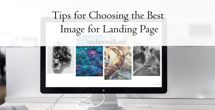
The landing page is considered a good tool for improving the website’s ranking, traffic, and your business in general. It differs from the home page since it focuses on some products or services and primarily serves as an advertising campaign.
If created carefully, the landing page might do wonders with your business. It might be an ad for a specific product from a store with a substantial discount, an invitation for an online event with a text form, or a call for a newsletter subscription, among other options. It should be call-to-action, suggesting to visitors what to do next with the help of specific buttons or forms.
1. Find an Authentic Image

When choosing the best image for your landing page, have in mind if that image provokes positively and takes out warm feelings from your visitors. It should remind visitors of their life alike scenes and show them their challenges in life or opportunities to improve their lives.
Moreover, the landing page image should be authentic and preferably taken for your company’s purpose. It can contain your company staff or former customers, so they can give and spread your message in the best way possible.
Stock images available are often misused, and they are everywhere online. If stock images are your only option, you should be careful and choose them wisely. Always have one thought in mind; it should be authentic and relatable for my customers to understand the right message about how my business can improve their life.
2. Carefully Select Colors and Text
Your landing page image should have a reasonable number of colors. If it is colorful, it can take focus from the essential things. Selected colors should be representative and suggest the products or services you are presenting. If you want to emphasize the elegance or mystery your product holds, you can consider using black color as the first choice.
For showing the stability or harmony that your product can contain, you can choose green, which also presents any movement and products related to nature and love towards nature life. The color blue is often used for representing intelligence and professionalism. Many huge successful companies choose it as their color number one. For using more than one or two colors, be careful with the combination and how their meanings can relate.
In addition, your text should be easy to read, thoughtful, and related to your product. It shouldn’t be out of context and should match the selected image. If the given image does not say the exact text as the given letters next to it, you did not find the right match. Also, the text should not cover the entire image. Making text of one color on a different background can wonders if selected correctly.
3. Connect Your Selected Image With Your Brand

While taking care of the content on the image and selecting the primary colors, you should always have in mind your brand and logo. The great move is to choose colors you already have on your logo.
Doing so makes an excellent cohesion and shows your professionalism in taking care of details. Also, if you are going with other colors due to the message they should send, you must include your logo in the appropriate place in the image.
4. Reduce Unnecessaries and Show the Important Parts
As with colors, your image should not have many unnecessary segments, making visitors wander around. You should reduce and exclude any visual noise to skip any negative result. If the image contains too many details with large texts, it cannot be appropriate.
Autoplay videos distract visitors, and their focus is on the wrong side. Those images take attention, and visitors lose focus without understanding what you want them to show. Your image should be clean, preferably centered around important buttons or messages. With that, you are suggesting a call to action politely. Also, it is recommended not to use video and carousels since it is proven that it confuses visitors and reduces conversion rates.
5. Optimize for Different Devices

The size of the selected image should be correct and aligned with the entire design of your website and page. Besides the size, it is essential to know that your image will work well on all devices. After checking the size in pixels and adjusting it to one display, you should not be surprised if it looks good on your mobile.
An image can lose a lot of its content on different devices, be stretched, fill the page, or even disappear. So, before putting it online, adjust your landing page image on all user devices, and be sure it will reach your new customers.
Conclusion
The images from landing pages should show how your product or company can benefit your customers. It should make a stronger bond between two sides, making a big step further to buying your product or service.
It is a strong enough reason to put considerable effort into selecting the best image for your landing page. Consider these tips and discover more for a successful landing page and the improvement of your business.
