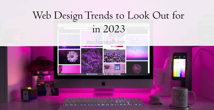
As of August 2021, an estimated 1.88 billion websites are present online. With this massive volume of websites on the internet, it’s crucial to keep updated on the current trends in web design to distinguish your website apart from others.
While designers do need to consider aesthetic choices in their creation process, these only cover the bare minimum of what elevates a web design. It’s part of a web designer’s skillset to engage current and potential customers in order to enhance a company’s online presence.
That being said, conceptualizing web pages requires collaboration between copywriters or even graphic designers. In crafting web layouts, the word- and graphic-based content should appeal to, if not reflect, a customer’s sensibilities.
It’s necessary to stay ahead of the curve and identify web design trends that will make your website stand out. In this article, we list down three web design trends you should look out for in 2023.
Mobile-first interface
Tried, tested, and effective— this design trend bears repeating, no matter what year it is. This is because 15% of American adults said they only used the internet through their smartphones. Phones can just as easily enable users to perform a search and visit a website efficiently, which is why web designs need to optimize a mobile user-friendly and mobile-intuitive interface.
To explain briefly, across all devices, your web pages are on the same URLs (this includes your HTML). However, the CSS changes, and this is what you need to alter to render your content across mobile devices. For one, consider using size percentages for your layout elements. Since CSS allows you to toggle the height and width of elements using pixels, adjust features like buttons to smaller screens.
Likewise, tailor your font size. Texts have to be responsive so users won’t only see a word or two on their screen before scrolling down. Lastly, we recommend installing a secure sockets layer to protect the safety of your users. A mobile-friendly interface is no good if there are potential breaches of your users’ data.
Parallax scrolling
Nowadays, scrolling is a way to engage users through animated interactive elements. Parallax scrolling is a visual technique that creates a faux-3D effect. This effect is done by making background images move slower than those in the foreground. If done well, parallax effects enliven flat pixels on a web page, which imbues a user’s experience with a sense of dimensionality.
Of course, you’ll need to consider how parallax scrolling is more effective in other facets of your website. The design effect can be wonderful when applied to image-heavy homepages, especially if you want a bit more complexity by using faux-3D elements. Likewise, you can adopt parallax on text. For example, incorporate a parallax effect inspired by the Star Wars opening credit if you want to feature an event on your page.
However, this effect may be overwhelming for corporate business pages, particularly when users have to go through whole chunks of information. In general, we recommend that you constrain movement effects within a small area of the screen. You can also include an option for users to turn off the effects. These guidelines just ensure your website visitors can access the parallax effect without worrying about potential feelings of dizziness.
Futuristic elements
With the rising popularity of metaverses and the development of virtual reality, futuristic elements remain relevant in web layouts. This is because bold neon colors and holographic displays make for an immersive user experience. Neon, in particular, is striking and easily recognizable, and there are numerous ways to apply this trend to your website. For typography, you can search for a neon alphabet kit with individual PSD or PNG characters— this way, you can create titles or quotes from them for landing pages.
Meanwhile, if you’re interested in incorporating holographic displays, claymorphism is a great option. This style blends charm with nostalgia, reminiscent of cartoons like Coraline. Claymorphism makes elements more prominent with its rounded 3D effect.
Of course, this design trend can just as easily disrupt the visual hierarchy of a web page if it jumps out from a block of text or if it takes up too much space. To avoid any jarring 3D imagery, and reinforce a good contrast in your web design, use minimal typography and strong accent colors. The mentioned tips are also a great way to accommodate users with color blindness.